Ralph's Coffee
Ralph's Coffee is not a standalone café.
It sits within the wider Ralph Lauren world: inside flagships in London, Doha and Singapore, or positioned as a cart at the entrance, or installed as a quiet room behind the store. The space changes, but the language does not. Deep green, white porcelain, a script logo, dark wood panelling, flowers on the table. Each location holds the same set of signals, arranged in a slightly different room.
This study looks at Ralph's Coffee through its repeated codes. Not as a single café, but as an observation of how a hospitality identity moves between cities without losing its form.
The cup is the consistent object.
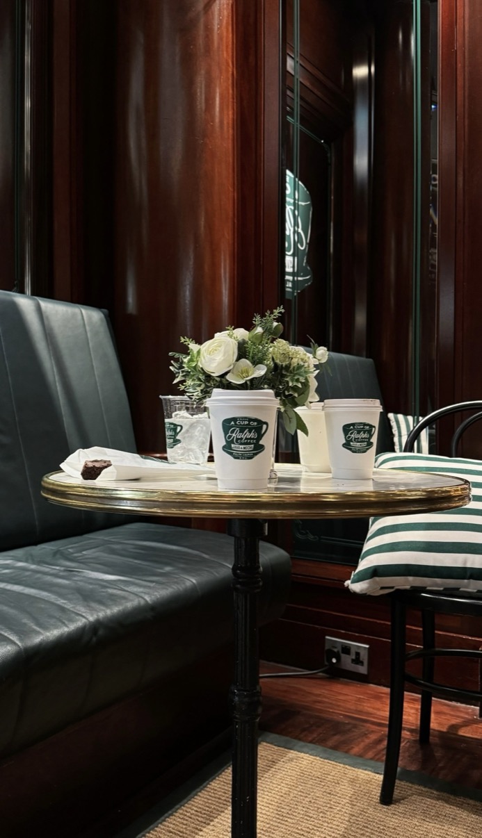
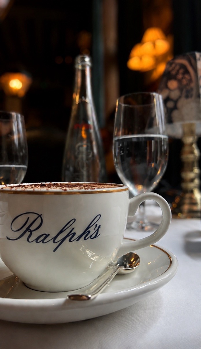
Whether it is a takeaway green-printed cup on a dark booth table or a white porcelain cappuccino beneath warm candlelight, it carries the same mark. It arrives with a spoon, a saucer, a glass of water. The ritual around the cup is considered rather than incidental. The table is set before anything is ordered. The flowers are placed. The lighting is held low.
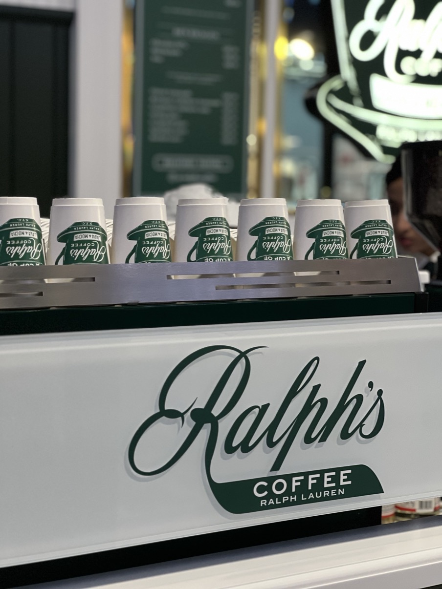
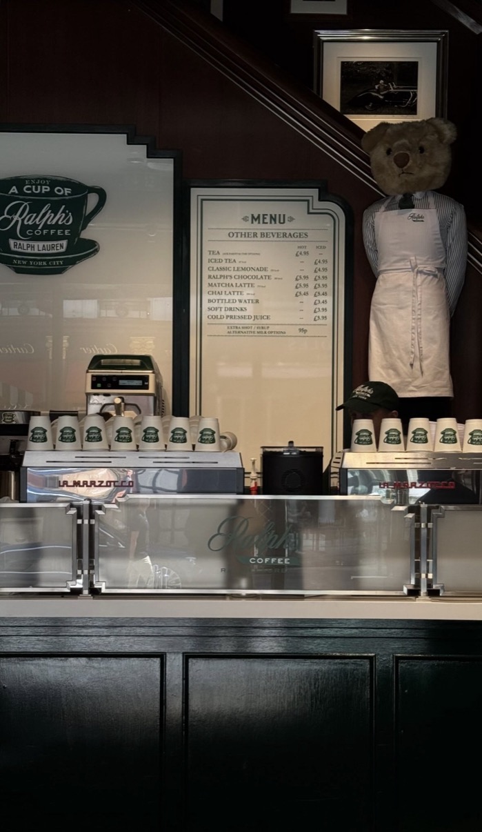
At the counter, branded cups are lined up in rows. The arrangement is not accidental. It reads as preparation, as readiness. The service is visible before the service begins.
The green is unmistakable.
The cart outside the London flagship carries it. The door sign uses it. The cushions are striped in it. Everything connects back to the same palette. White for the cup and the counter. Green for every other surface that holds the brand.
Inside, the room shifts. Dark mahogany panelling, a chandelier, arched windows, a polished counter with the Ralph's Coffee name in script. The interior is warmer and more formal than the cart outside. The visual language adapts to scale and setting, but the mark holds across both.
In London, in Doha, in Singapore: the same cup, the same green, the same script. Recognition becomes part of the experience.
This study is about a hospitality identity that travels without translation.
Ralph's Coffee does not need to explain itself in each city it occupies. The cup, the counter, the colour and the mark do the work. London, Doha and Singapore become different settings for the same repeated gesture: a script logo, a white cup, a polished surface, a moment before the next order.
For mkd STUDIO, Ralph's Coffee becomes a study of brand as ritual. A place where the experience begins with recognition, and recognition is enough.
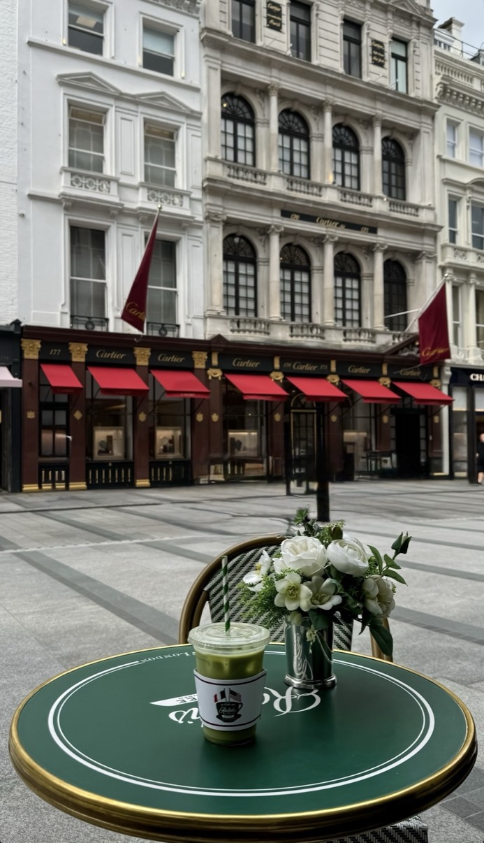
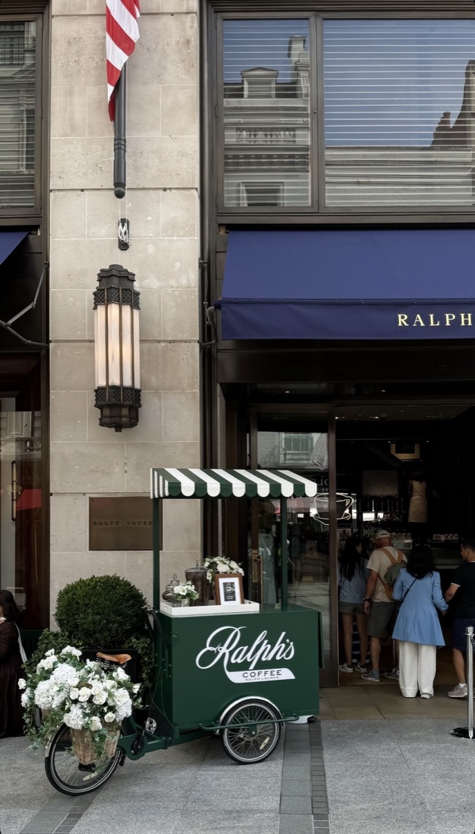
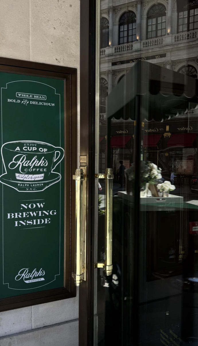
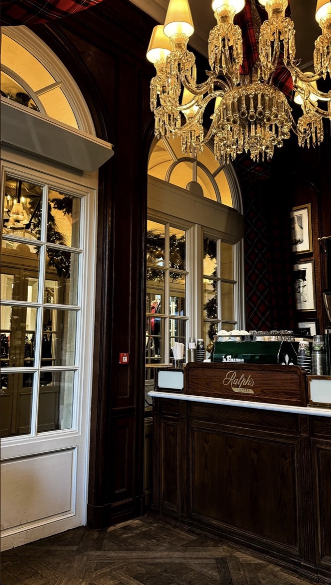
Ralph's Coffee is the café arm of Ralph Lauren, installed inside or beside the brand's flagships from New York to Tokyo, and this study follows it across three of them: London, Doha and Singapore. The premise is an unusual editorial opportunity, the same small hospitality concept, reproduced across continents, always from the same kit of parts: the green, the white porcelain, the script logo, dark timber, fresh flowers. Three cities, one room, assembled slightly differently each time.
The photographs work comparatively, holding the constants and letting the variations show: the cart scaled for a mall entrance in Doha, the panelled room folded into the London store, the counter meeting Singapore's light. The study's real subject is brand transmission at café scale, how few elements a strong identity actually needs, and how completely those few must be controlled. In that sense it is a companion piece to Cipriani Dolci, another system of signals crossing the world intact.
In the archive the study serves the craft category's central question, what a brand's physical presence communicates that its products cannot, and it regularly informs the studio's conversations with retail clients about documenting identity rather than merchandise. The three-city structure also demonstrates a commissioning format the studio favours: the same eye, carried across a brand's locations, producing a record no local photographer working alone could make.